BOOTSTRAP 4 IMAGES
In this tutorial, you will learn about working with images in Bootstrap. You will learn to create responsive images, thumbnail images, circle images, image galleries, etc.
img Bootstrap
Images play an important role in any website, they hold users for a long and also provide valuable information. So your images on your website must be responsive and could fit all kinds of devices easily.
With Bootstrap, you can easily make your images responsive, and style in easily.
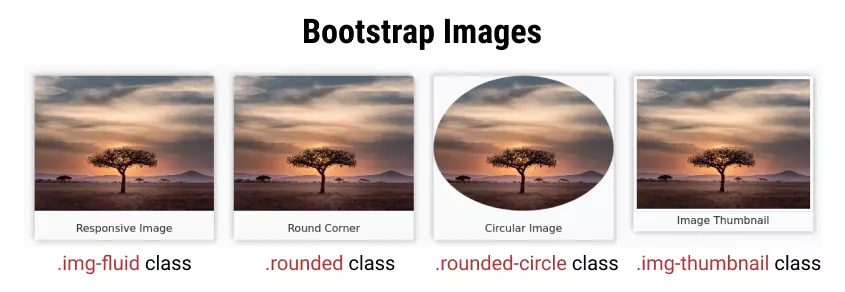
- Bootstrap Image Responsive
- Rounded image
- Circle image
- Image Thumbnail
- Align Image Left/Right
- Bootstrap Image Center
- Bootstrap Image and Text Side by Side
- Image Link
- FAQ
Table of Contents
Bootstrap Responsive Image
Images make websites more attractive and informative, so you must make your image responsive.
All mages have some fixed width and height. If it is not styled properly then it overflows the screen of the device.
Bootstrap contains many predefined classes using which we can get any desired results. Use .img-fluid class on the image itself to make images responsive. After using this class image adjust its size according to different devices
The CSS property used in class .img-fluid are:
max-width: 100%;height: auto;
Output:
The max-width CSS property restricts the image to overflow from the screen and the height of the image adjusts automatically which makes the image responsive.
Bootstrap Rounded Image
Using bootstrap you can also create a rounded image whose corners are round in shape. To make images have rounded corners use .rounded class on the image.
If you also want the image to be responsive, you must use the .img-fluid class explicitly with it.
The Bootstrap's .rounded class CSS property is:
border-radius: 0.25rem !important;
Example
<img
  class="rounded"
  src="lonely-tree.jpg"
  alt="Rounded cornor Image"
>

<!-- To make image responsive also use .img-fluid class with it -->
<img
  class="rounded img-fluid"
  src="lonely-tree.jpg"
  alt="Rounded cornor Image"
>Bootstrap Circle Image
To make images circular use .rounded-circle class on the image.
If you want to also make your image responsive, you must use the .img-fluid class explicitly.
Bootstrap's rounded-circle class property is:
border-radius: 50% !important;
Example
<!-- Rounded but non-responsive -->
<img
  class="rounded-circle"
  src="lonely-tree.jpg"
  alt="circular image non responsive"
>

<!-- Rounded and responsive -->
<img
  class="rounded-circle img-fluid"
  src="lonely-tree.jpg"
  alt="circular image and responsive"
>Bootstrap Thumbnail Class
To make your image look like a thumbnail use the
With the
The Bootstrap's .img-thumbnail CSS class properties are:
padding: 0.25rem;background-color: #fff; (white)border: 1px solid #dee2e6;border-radius: 0.25rem;max-width: 100%;height: auto;
Output:

Bootstrap Align Image Left/Right
In an article, you need some time to align your images, with Bootstrap you can do it easily.
To align the image left use .float-left class and to align the image right use .float-right class on the image.
Example
<!-- image float left -->
<img
  class="float-left"
  src="lonely-tree.jpg"
  alt="Image floating left"
>

<!-- image float right -->
<img
  class="float-right"
  src="lonely-tree.jpg"
  alt="Image floating left"
>Output:
Bootstrap Center Image
To align the image center use class .mx-auto and .d-block together on your image.
.mx-auto sets margin-left and margin-right to auto, while the .d-block class makes an image element to a block element (by default image is an inline element).
CSS properties of used classes are as follows:
- mx-auto :
margin-left: auto !important;margin-right: auto !important;
- d-block :
display: block !important;
Another way to align the image center is using an image inside a 'div' element with a class text-center.
Example
<div class="text-center">
  <img src="lonely-tree.jpg" class="img-fluid rounded" width="250" alt="Image floating canter">
</div>Output:
Bootstrap image and text side by side
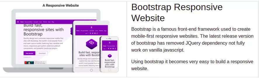
On most websites, you would have seen image and text side by side where text and image explain each other and looks very cool.
To create image and text side by side use the grid system property of bootstrap and create 2 columns of span 6-6.
Put your image in one column and your text in another. On smaller devices, it will automatically align vertically. See the example below.
Example
<div class="container-fluid">
  <div class="row">
    <div class="col-xl-6 col-lg-6 col-md-6" style="border:1px solid #ddd">
      <img src="./assets/bootstrap/responsive-website-with-bootstrap.png" alt="responsive webite" class="img-fluid">
    </div>
    <div class="col-xl-6 col-lg-6 col-md-6" style="border:1px solid #ddd">
      <h2>Bootstrap Responsive Website</h2>
      <p>Bootstrap is a famous front-end framework used to create mobile-first responsive websites. The latest release
        version of bootstrap has removed JQuery dependency not fully work on vanilla javascript.</p>
      <p>Using bootstrap it becomes very easy to build a responsive website.</p>
    </div>
  </div>
</div>Output:
Image and text side by side Bootstrap
Bootstrap Image Link
To create an image link put your image in an anchor tag and set URL as href value. You can also set .img-fluid or .img-thumbnail to the image.
Example
<a href="https://tutorialstonight.com" title="Go To Home Page">
  <img src="./assets/logo.png" alt="logo" class="img-thumbnail">
</a>Frequently asked questions
What is responsive Image in bootstrap?
Responsive images are those which adjust their size automatically according to device-width and never overflows out of screen size.
how to make image rounded in bootstrap?
Add .rounded class to your image.
How do I circle an image in bootstrap?
Add a .rounded-circle class to your image.
Points to remember:
- To make the image responsive use the .img-fluid class on the image.
- To make image rounded use .rounded class.
- For circular image use .rounded-circle class.
- To make an image look like a thumbnail use the .img-thumbnail class.
- To align image centre use .mx-auto and .d-block together.
- To align the image center you can also put an image in a div element with class .text-center.