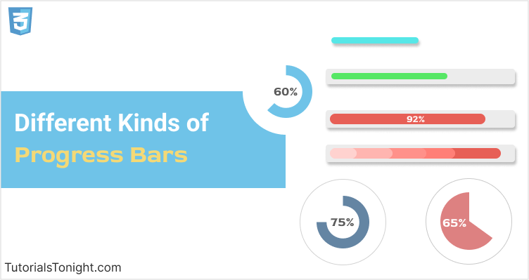
10 Different CSS Progress Bar
CSS Progress bar is used to show the progress of some ongoing task. They are used on websites to show the progress of a download, upload, or some other process like a game level, etc.
It creates a visual cue for the user that something is happening in the background and keeps them engaged.
Adding a progress bar to your website or projects will improve the user experience and make your website more interactive.
You can use all progress bars discussed in this article in your projects for free.🥳
1. Simple Progress Bar
To start with let's choose the simplest progress bar. It is a simple horizontal bar with a colored background.
Create a <div> element and add a class progress to it.
Set the width of the progress bar to 40% (you can change it to any value you want).
<div class="progress"></div>Now style it to look like a progress bar. Set its height to 20px, and add some background color and border radius.
Output
2. CSS Progress Bar with Background
The above progress bar doesn't look that great, since we made it very simple. Let's add some background to it and make it look more attractive.
To add a nice background behind the progress bar we need to change both CSS and HTML.
First nest above <div> inside another <div> and add a class progress-container to it. We will add background to this element.
<div class="progress-container">
<div class="progress"></div>
</div>Now add some background color to the progress-container and set its height the same as the progress bar. (Setting height is optional, but it will make the progress bar look more attractive).
Also, add some border radius to the progress-container to make it look more rounded.
Example
.progress-container {
height: 20px;
background-color: #ddd;
border-radius: 10px;
}
.progress {
  height: 20px;
  border-radius: 10px;
  background-color: #4CAF50;
}Output
3. CSS Progress Bar with Text
When you look at both of the above progress bars you will feel like something is missing🤔. And when you look at it closely🧐 you will realize that it is the progress percentage.
Progress percentage gives us an instant idea of the progress and it's must to have one in your progress bar.
To create a progress bar with text we are going to have the same HTML code as above but we will add some text inside the progress element.
In styling, we can add some text color, font size, and alignment to make it look beautiful.
Example
.progress-container {
  height: 20px;
  background-color: #ddd;
  border-radius: 10px;
}

.progress {
  height: 20px;
  border-radius: 10px;
  background-color: #4CAF50;
  color: #fff;
  font-size: 12px;
  text-align: center;
  line-height: 20px;
}Output
4. Progress Bar CSS Animation
Now that we have a progress bar with text, let's add some animation to it.
For animation, we will use CSS3 Animation. We will add a transition property to the width property of the progress element.
There is little change in HTML and CSS code. In HTML add data-progress attribute to the progress element and set its value to the progress percentage. In CSS add the transition property to the width property.
Finally, apply JavaScript to the progress element to set its width to the value of data-progress attribute.
Here is the complete code.
Example
<!DOCTYPE html>
<html lang="en">

<head>
  <meta charset="UTF-8">
  <title>CSS - Progress bar 4</title>
  <style>
    .progress-container {
      height: 20px;
      background-color: #ddd;
      border-radius: 10px;
    }

    .progress {
      height: 20px;
      border-radius: 10px;
      background-color: #4CAF50;
      color: white;
      font-weight: bold;
      text-align: center;
      transition: all 1s ease;
      width: 0;
    }
  </style>
</head>

<body>
  <h1>Progress bar with nice animation using HTML, CSS and JavaScript</h1>
  <p>Click on the progress bar to see the animation</p>

  <div class="progress-container">
    <div class="progress" data-progress="65">0%</div>
  </div>

  <script>
    var progressContainer = document.querySelector('.progress-container');
    var progress = document.querySelector('.progress');
    var progressWidth = progress.getAttribute('data-progress');

    // adding click event listener to the progress container
    progressContainer.addEventListener('click', function () {
      progress.style.width = progressWidth + '%';
      progress.innerHTML = progressWidth + '%';
    });
  </script>
</body>

</html>Output
Click on the progress bar to see the animation.
5. Progress Bar with Multiple Steps
Now we will create a progress bar with multiple steps. We will add the next button to the progress bar. When the user clicks on the next button, the progress bar will move to the next step.
For this, we will add a data-step attribute to the progress element. The value of the data-step attribute will be the percentage of the progress bar.
Here is the complete code.
Example
<!DOCTYPE html>
<html lang="en">

<head>
  <meta charset="UTF-8">
  <title>CSS - Progress bar 5</title>
  <style>
    .progress-container {
      height: 20px;
      background-color: #ddd;
      border-radius: 10px;
    }

    .progress {
      height: 20px;
      border-radius: 10px;
      background-color: #4CAF50;
      color: white;
      font-weight: bold;
      text-align: center;
      transition: all 1s ease;
      width: 0;
    }

    .next {
      background-color: #6980e4;
      border: none;
      border-radius: 0.25rem;
      color: white;
      padding: 10px 25px;
      display: block;
      font-size: 16px;
      margin: 10px auto;
      cursor: pointer;
    }

    .next:hover {
      background-color: #5064bd;
    }
  </style>
</head>

<body>
  <h1>Progress bar with multiple steps</h1>
  <p>Click on the next button to see the animation</p>

  <div class="progress-container">
    <div class="progress" data-step="25, 40, 55, 80, 100">0%</div>
  </div>

  <button class="next">Next</button>

  <script>
    var progressContainer = document.querySelector('.progress-container');
    var progress = document.querySelector('.progress');
    var next = document.querySelector('.next');
    var steps = progress.getAttribute('data-step');

    // converting the string to array
    steps = steps.split(',').map(function (item) {
      return parseInt(item);
    });

    // adding click event listener to the next button
    next.addEventListener('click', function () {
      var currentProgress = 0 || parseInt(progress.innerHTML);
      var nextProgress = steps.find(function (item) {
        return item > currentProgress;
      });

      if (nextProgress) {
        progress.style.width = nextProgress + '%';
        progress.innerHTML = nextProgress + '%';
      }
    });
  </script>
</body>

</html>Output
6. Circular Progress Bars
A group of circular progress bars of various different types and colors from CodePen.
This pen contains 9 different types of circular progress bars. You can use any of them in your project.
See the Pen Pure CSS radial progress bar by Alex Marinenko (@jo-asakura) on CodePen.
7. Stylish Progress Bar
A stylish progress bar with a modern interface. You can interact with this progress bar by clicking on the buttons.
When you click the percentage button, the progress bar will be filled with the percentage you have entered and will change the color of the progress bar.
See the Pen Animated Progress Bar by Thibaut (@Thibaut) on CodePen.
8. SVG Progress Bar
An interactive SVG progress bar with a circular animation. You can interact with this progress bar by typing the percentage in the input field.
When you type the percentage, the circular progress bar will be filled with the percentage you have entered and with a nice animation.
See the Pen SVG Circle Progress by Jon Christensen (@JMChristensen) on CodePen.
9. Animated Progress Bar with Tooltip
An animated progress bar with a tooltip. Made using Bootstrap 4. The transition is very smooth and looks very professional.
See the Pen bootstrap, progress-bar, tooltip,progress bar by A G (@valencia123) on CodePen.
10. Payment Progress Bar
This is a real life example of one of the uses of progress bars. The following pen contains a payment progress bar in a step-by-step format.
The progress bar contains 4 steps. You can click on any step to go to that step. The progress bar makes a smooth transition to that step.
See the Pen Progress Bar by Andy Tran (@andytran) on CodePen.
Conclusion
Adding a progress bar will increase both beauty and functionality of your website. We have looked at almost every possible type of progress bar in this article.
The article covers the creation of progress bars from basic to advance in step by step process.
Also, look at how to create CSS Toggle Switch with Text.