BOOTSTRAP 4 GRID SYSTEM
In this tutorial, you will learn how to use the Bootstrap 4 grid system. You will also learn how to use the grid system to create a responsive layout for your website.
What Is Bootstrap Grid System
A grid in bootstrap is a 2-dimensional structure that is made up of a series of lines arranged in a horizontal and vertical manner.
The Grid system is one of the most important concepts of Bootstrap. Grids in bootstrap are used to arrange components of the webpage in rows and columns.
Bootstrap 4 provides a grid system that is built on top of the flexbox system. The grid system is a powerful mobile-first flexbox system that makes building responsive layouts simple and easy.
It's built with 12-column classes, available for every device and viewport, from mobile phones to large desktops.
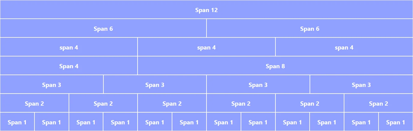
The Bootstrap grid consists of 12 columns. These 12 columns can be grouped together in any combination but the sum of all grids in a row should not exceed more than 12.
Look at the following image to understand grid flow in a row.
How Does It work?
For the grid system to work, Bootstrap uses a series of <div> elements nested inside each other.
First, there is a container which is the parent element for the grid, then inside it, there is another element with class row and inside it, your grid element lies with classes like .col-sm-3, .col-md-6, .col-lg-8, etc.
Bootstrap is built with CSS flexbox and is fully responsive.
Bootstrap 4 provides classes for 4 different device sizes. Using these classes grids are defined in bootstrap.
Bootstrap grid class lookes like as follow: .col--. Example: .col-sm-4, .col-md-4, .col-lg-4, .col-xl-4, etc
Example
<div class="container">
  <div class="row">
    <div class="col-md-4">Column 1 of three</div>
    <div class="col-md-4">Column 2 of three</div>
    <div class="col-md-4">Column 3 of three</div>
  </div>
</div>Output: The following columns will be ordered in a row in device size greater than or equal to the medium device, on smaller than this it will be ordered in a row.
The above example creates 3 equal width columns on medium, large and extra large devices.
For smaller device size columns automatically flow to a new line.
Let's break down the above code:
- The
.containerclass wrap the row elements and pad the site's content. - The
.rowclass wraps the column elements. Each column has horizontal padding (called a gutter) for controlling the space between the columns. - The horizontal padding in columns is counteracted by a negative margin on rows, this makes contents in columns visually aligned down the left side.
- The content must be placed within the columns and only columns may be immediate children of rows.
Bootstrap Grid Options
The grid system is built with 12 columns and is responsive. The grid is completely responsive, so you can specify breakpoint specific column classes for easy control of the Bootstrap grid on small, medium, large, extra large devices.
Bootstrap provides four grid tiers to customize the number of columns on small, medium, large, and extra large devices.
| Feature | Extra small <576px |
Small ≥576px |
Medium ≥768px |
Large ≥992px |
Extra Large ≥1200px |
|---|---|---|---|---|---|
| Max container width | None (auto) |
540px | 720px | 960px | 1140px |
| Class prefix | .col-* , .col (replace * by :sm,md,lg) |
.col-sm-* (replace * by grid size) |
.col-md-* | .col-lg-* | .col-xl-* |
| Device | Small screens | Mobile | Tablet | Laptop | Desktop or laptop |
| Number of columns | 12 | ||||
| Gutter width | 30px (15px left and 15px right) | ||||
| Nestable | Yes | ||||
| Column ordering | Yes | ||||
Using the above information let's have a look at the basic structure of the Bootstrap grid.
Example
<div class="container">
  <!-- defining 2 equal width column -->
  <div class="row">
    <div class="col"></div>
    <div class="col"></div>
  </div>
  <!-- defining 2 equal width column for device -->
  <div class="row">
    <div class="col-*"></div>
    <div class="col-*"></div>
  </div>
  <div class="row">
    <div class="col-*-*"></div>
    <div class="col-*-*"></div>
    <div class="col-*-*"></div>
    <div class="col-*-*"></div>
  </div>
</div>
To create grid system first create a container with .container or .container-fluid
class.
Then wrap .row elements within the container and create columns inside the rows using column
classes like .col, .col-* or .col-*-*.
Note: The grid size in each row should be equal to 12. If it exceeds 12 then elements will overflow to the next row.
Bootstrap grid examples
Below are some examples of the grid system in action. The examples are built using the default settings of Bootstrap.
2 equal width column
In the above grids, the first section is a 2 column row with equal width on all devices.
While in the second section we have 2 column rows with equal width on devices of size sm and up.
Code:
Example
<div class="container">
  <!-- Defining 2 equal width column -->
  <div class="row">
    <div class="col">.col</div>
    <div class="col">.col</div>
  </div>
  <!-- Defining 2 equal width column for small device -->
  <div class="row">
    <div class="col-sm-6">.col-sm-6</div>
    <div class="col-sm-6">.col-sm-6</div>
  </div>
</div>3 unequal width columns
Resize the window to see how the equal width columns behave.
Example
<div class="container">
  <div class="row">
    <div class="col">.col ((100 -16.66 ) / 2 % width)</div>
    <div class="col-2">.col-2 (16.66% width)</div>
    <div class="col">.col ((100 - 16.66) / 2 % width)</div>
  </div>
  <div class="row">
    <div class="col-md-2">.col-md-2 (1/6 width column)</div>
    <div class="col-md-4">.col-md-4 (1/3 width column)</div>
    <div class="col-md-6">.col-md-6 (1/2 width column)</div>
  </div>
</div>Grid with 4 columns on large, 2 columns on medium and 1 column on small
Example
<div class="container">
  <div class="row">
    <div class="col-lg-3 col-md-6">.col-lg-3 .col-md-6</div>
    <div class="col-lg-3 col-md-6">.col-lg-3 .col-md-6</div>
    <div class="col-lg-3 col-md-6">.col-lg-3 .col-md-6</div>
    <div class="col-lg-3 col-md-6">.col-lg-3 .col-md-6</div>
  </div>
</div>5 Equal width column
To create equal width column use .col class. The .col class creates columns that have equal width.
The .col class is used when you need just need an equal width column regardless of device size.
If you want to break these equal width column at certain device then use .col-sm, .col-md, .col-lg or .col-xl according to your need.
Example
<div class="container-fluid">
  <div class="row">
    <div class="col">Column 1 (.col)</div>
    <div class="col">Column 2 (.col)</div>
    <div class="col">Column 3 (.col)</div>
    <div class="col">Column 4 (.col)</div>
    <div class="col">Column 5 (.col)</div>
  </div>
  <!-- break below small device -->
  <div class="row">
    <div class="col-sm">Column 1 (.col-sm)</div>
    <div class="col-sm">Column 2 (.col-sm)</div>
    <div class="col-sm">Column 3 (.col-sm)</div>
    <div class="col-sm">Column 4 (.col-sm)</div>
    <div class="col-sm">Column 5 (.col-sm)</div>
  </div>
</div>The above example creates 5 equal-width columns on all kinds of devices small, medium, large and extra large
using predefine grid class .col.
Note: In smaller devices, it may flow to the new line using the .col-sm class because the content could no longer fit in the same line.
Other Classes Which Create Equal Width Grid
There are 4 more classes to create an equal width grid but these classes have their special breakpoints, below that breakpoint grids will no longer stay in a row but get arranged in a column covering 100% width.
The 4 other classes are :
.col-sm: Creates equal width column but with device having screen size 576px or lower, it covers 100% width..col-md: Creates equal width column but with device having screen size 768px or lower, it covers 100% width..col-lg: Creates equal width column but with device having screen size 992px or lower, it covers 100% width..col-xl: Creates equal width column but with device having screen size 1200px or lower, it covers 100% width.
<div class="container-fluid">
  <div class="row">
    <div class="col-sm">Column 1 (.col-sm)</div>
    <div class="col-sm">Column 2 (.col-sm)</div>
    <div class="col-sm">Column 3 (.col-sm)</div>
  </div>
  <div class="row">
    <div class="col-md">column 1 (.col-md)</div>
    <div class="col-md">column 2 (.col-md)</div>
    <div class="col-md">column 3 (.col-md)</div>
    <div class="col-md">column 4 (.col-md)</div>
  </div>
  <div class="row">
    <div class="col-lg">column 1 (.col-lg)</div>
    <div class="col-lg">column 2 (.col-lg)</div>
    <div class="col-lg">column 3 (.col-lg)</div>
    <div class="col-lg">column 4 (.col-lg)</div>
    <div class="col-lg">column 5 (.col-lg)</div>
  </div>
  <div class="row">
    <div class="col-xl">column 1 (.col-xl)</div>
    <div class="col-xl">column 2 (.col-xl)</div>
    <div class="col-xl">column 3 (.col-xl)</div>
    <div class="col-xl">column 4 (.col-xl)</div>
    <div class="col-xl">column 5 (.col-xl)</div>
    <div class="col-xl">column 6 (.col-xl)</div>
  </div>
</div>Responsive Columns
The other Bootstrap classes like .col-sm-*, .col-md-*, .col-lg-* and
.col-xl-* create grid of specified size which is reponsive and grid size adjust itself to best fit
in any device.
The total number of columns in a grid is 12. Using these classes you can create any combination of grids but in
a row number of the column should be equal to 12. Example: .col-sm-4, .col-sm-4 and
.col-sm-4 create 3 columns of size 4, sum 4+4+4 = 12.
Creating Equal Width Responsive Grids
The following example will show you how to create responsive equal width grids. The grids will be aligned horizontally in laptops, computers, and tablets but in mobile, it will automatically become horizontal and cover the full screen. This is what responsiveness is about to best fit in different devices.
<div class="container-fluid">
  <!-- Two equal sized grid 6 + 6 = 12 -->
  <div class="row">
    <div class="col-md-6">Column 1</div>
    <div class="col-md-6">Column 2</div>
  </div>
  <!-- Three equal sized grid 4 + 4 + 4 = 12 -->
  <div class="row">
    <div class="col-md-4">Column 1</div>
    <div class="col-md-4">Column 2</div>
    <div class="col-md-4">Column 3</div>
  </div>
  <!-- Four equal sized grid 3 + 3 + 3 + 3 = 12 -->
  <div class="row">
    <div class="col-md-3">Column 1</div>
    <div class="col-md-3">Column 2</div>
    <div class="col-md-3">Column 3</div>
    <div class="col-md-3">Column 4</div>
  </div>
</div>Output:
Note: Result can be seen better in big devices like laptops.
Creating Unequal Width Responsive Grids
The following example will show you how to create responsive unequal width grids. The grids will be aligned horizontally in laptops, computers, and tablets but in mobile, it will automatically become horizontal and cover the full screen. This is what responsiveness is about to best fit in different devices.
All grids sum up to 12 in a row. From below example: 10+2=12, 3+6+3=12 and 2+6+1+3=12 .
<div class="container-fluid">
  <!-- Two grid of size 10 and 2 -->
  <div class="row">
    <div class="col-md-10">Span 10</div>
    <div class="col-md-2">Span 2</div>
  </div>
  <!-- Three grid of size 3,6 and 3 -->
  <div class="row">
    <div class="col-md-3">Span 3</div>
    <div class="col-md-6">Span 6</div>
    <div class="col-md-3">Span 3</div>
  </div>
  <!-- Four grid of size 2,6,1 and 3 -->
  <div class="row">
    <div class="col-md-2">Span 2</div>
    <div class="col-md-6">Span 6</div>
    <div class="col-md-1">Span 1</div>
    <div class="col-md-3">Span 3</div>
  </div>
</div>Output:
Note: Result can be seen better in big devices like laptops.
Conclusion
The bootstrap grid system is a powerful tool to create a responsive website. It is very easy to use and understand. It is also very easy to extend and customize. The grid system is very flexible and can be used to create a wide variety of layouts.